Introduction
The graphic image of a company is directly linked to positioning the
company in the public mind. To do this, the name of the company, the
logo design and the image must be in harmony and match each other, to
ensure the success of our commercial project. Likewise, the
company’s graphic image must be consistent with the
company’s product or brand. Any error or inconsistency can totally
affect the public and reduce profitability. In this sense, the starting
point of any marketing strategy is to build the brand. You need to find
a professional and experienced Desktop
Publishing Service to make your brand identity.

Brand
In the world of communication, the word brand goes beyond graphic
representation. A brand is also related to the concept that remains in
the imagination of people when thinking about a company.
For example, when talking about Adidas, as soon as you think about practicing high-performance sports, with style and quality. It is that “image” that you see in your head what the brand represents. But also, the term brand is used a lot to refer to the logo; which is not completely wrong.
Logo
In its essence, the word logo comes from the Greek logos, which
translated into Spanish, from the meaning of the psychological current,
is “meaning”.
In communication/design, a logo is a symbol by which your brand/company/ business is recognized. A logo is a graphic representation of the identity of a brand. This representation or symbol can be composed of text, a combination of text and graphic elements or only by a graphic element. Normally a brand has more than one version of its logo (only text, only symbol or both combined). The logo of a brand serves so that we can identify it quickly, differentiate it and capture its essence at a glance.
Slogan
Some people use the word slogan to refer to the logo, but this time,
there is confusion regarding the similarity of the words. The truth,
slogan has nothing to do with the logo. The slogan is a phrase or an
expression that defines the company; however, it is the work of the
editors, not the designers.
Why is the logo of a brand so important?
The logo is the most important graphic representation and of a brand. It is the visible face of your project and represents your identity and values, providing essential information to your potential clients. Our logo is what gets someone to identify our brand in any advertising material, from a simple invoice sent to an @ client @, to a billboard.
A well designed and attractive logo:
- Help build the identity of the brand
- Build a brand image that conveys confidence
- It helps us distinguish ourselves from the competition
- It makes us easily identifiable
- Connect with our target audience
Is it
challenging?
The assignment excellence of any designer is the creation of a visual
identity, what we know as branding. Because it is to reflect the spirit
of a company and its brand in a graphic design. It is a project that
seems easy for any mortal but any graphic designer knows from experience
that it is one of the most complicated of our profession, for several
reasons: it must be transmitted with the minimum (text and symbol) the
whole of a company, there is a lot of competition and to create
something different from the rest, after hundreds of years of design
history, it is frankly a complex challenge. But you are not alone in the
process, we give you the best keys to get the inspiration and the
technique so that you get a professional branding from Clipping Way.
Branding is not just the creation of a logo, a layout of graphic elements or the choice of colors. It’s a story that is told to convey the deep personality of your company, its goals, aspirations, values and promise to its audience. Your brand must communicate consistently to ensure a sense of belonging, trust and security. We are a branding agency in Montreal and we master the creation of effective and customized visual language that will help you achieve your business objectives.
Functions of the company’s graphic image
- Highlight the true identity.
- Transmit prestige
- Improve attitude and performance.
- Improve the quality
- Launch new products/services.
- Acquire new markets
Five reasons to consider:
- Poor design a bad design is a terrible image for the company because it raises doubts about professionalism. Therefore, a good image distinguishes the company from the competition and is likely to remain in the public mind.
- A design that no longer works. We live in a world where technology advances very fast and changes are exposed to everything in a very fast way. It is necessary to emphasize that the design is similarly linked with what was described above. When this happens a change of image is necessary for the design.
- A change of strategy. Companies must always change through the demands of the market and many elements may arise that require taking measures such as changing strategies that are followed. This is normal in a market that is governed by new technologies and by the user or public.
- Change the perception of the public. Sometimes it is necessary for companies to renew their logo and their company image, in order to renew their image before society in general. Usually companies that do this, do so to give a more innovative, technological profile that goes with current trends.
- To create new lines of business. Companies can do this for different reasons, such as exploiting a market niche, placing a new line of products or entering a new market, etc. With this, it means that the image can be modified, adapted or totally reconsidered, redefining the corporate identity of the company.

Branding Guidelines and Graphic Design
Keys to visual identity – branding:
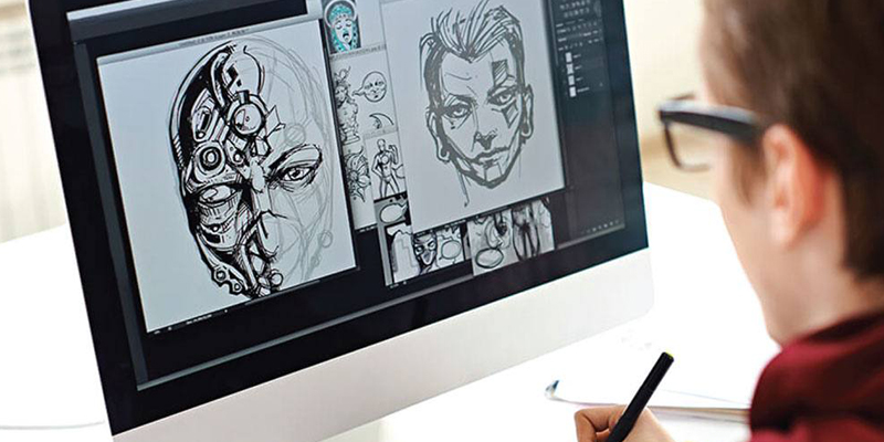
Instinctive sketches. Surely already reading the briefing you open through your head a couple of brands, draw them even if it is part of your instinct of designer and save them. Follow the next step and then take another look at them. Observe the competition and references of the card. As in any graphics project you can see direct, indirect and international competition, learn a lot from their styles, lines, types of shapes, typography and above all do not fall for their typical visual errors: as if you do not perceive the details well or it seems outdated. Here you can start researching on Google, analyze the strengths and look for different solutions.
Verdict:
Now knowing the keys and process for the design of a brand you can get
down to work. Did you know that brands can have different versions
separating logo symbol? Do you start with sketches or do you look
directly at the competition before you start?